Carcraft
Client
CarFinance 247
Services
Brand Design Design System UI & UX Design
Date
2021
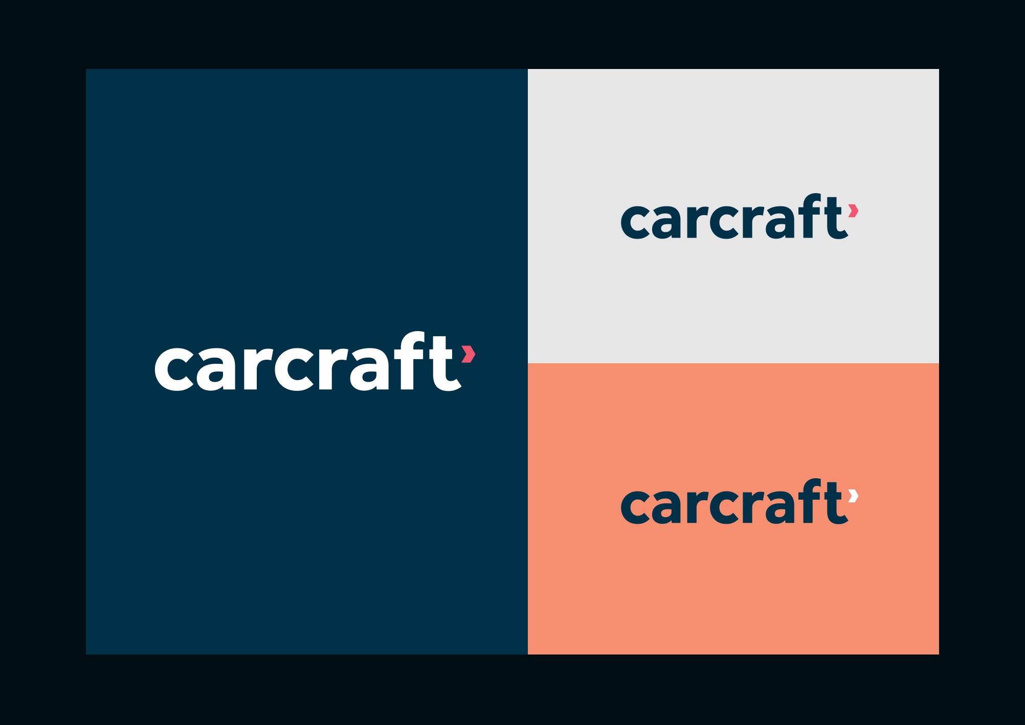
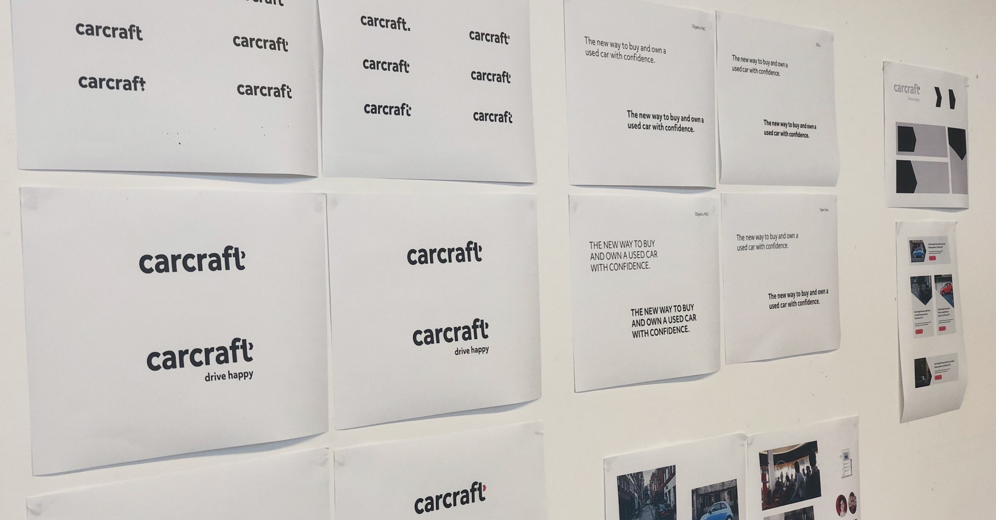
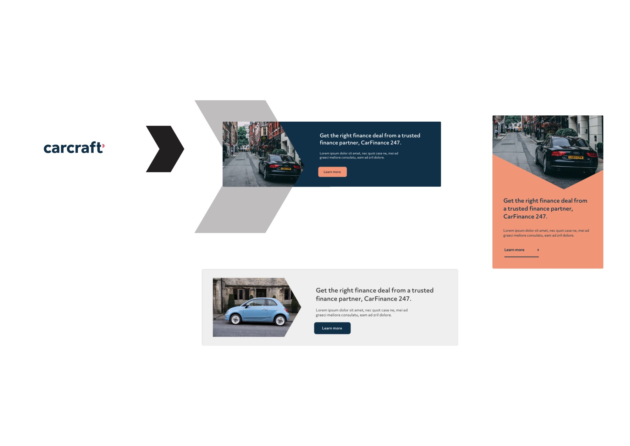
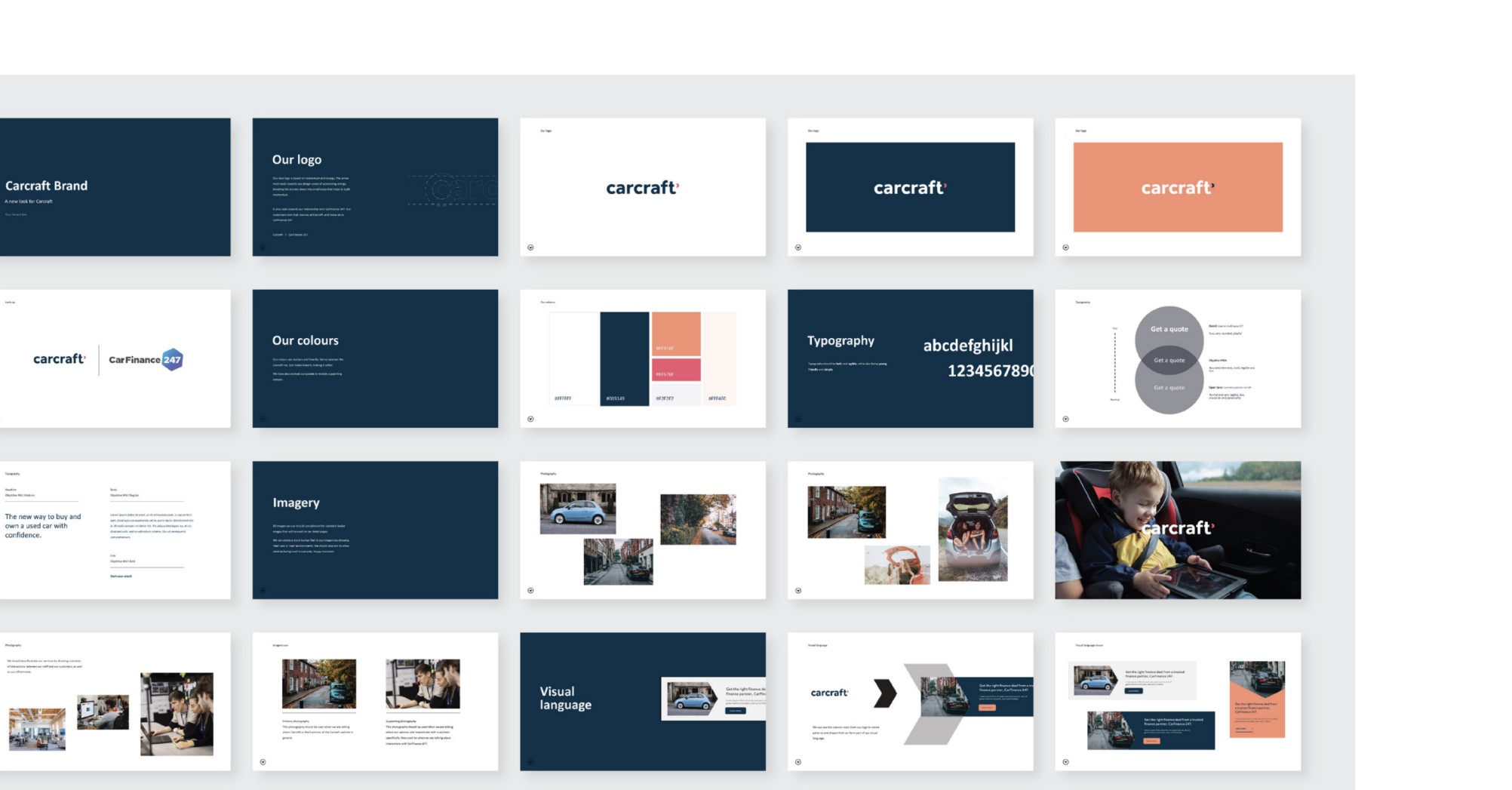
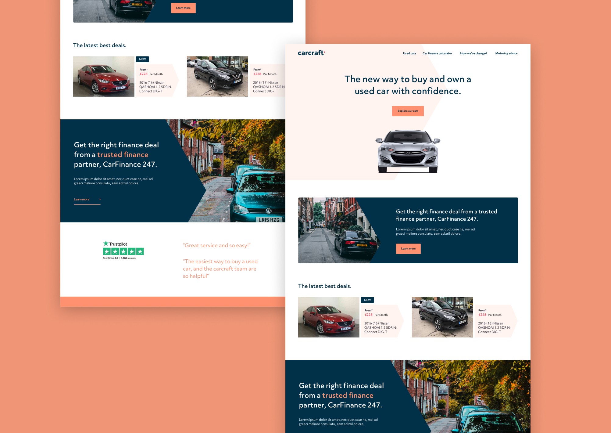
After understanding the stakeholders aspirations through a set of moodboard exercises I worked through a series of quick iterations for the visual identity. This allowed us to critique and refine the direction as a group finally creating a new identity, logo, and visual language that aimed to modernise the brand, bringing it into the digital age. The new logo is based on momentum and energy. The arrow mark nods towards their design vision of assembling energy, breaking the process down into small steps that help to build momentum. It also nods towards their relationship with CarFinance 247. Customer start their journey at Carcraft and then move onto complete their journey at CarFinance 247. - Visual Design - The chevron mark was used to create patterns and shapes that formed part of the visual language. The final visual identity aimed to feel modern and friendly. We retained some elements of the original Carcraft brand as a nod to their heritage but evolved key elements such as the typeface and colours to make the brand feel more inclusive and lass masculine.
After launching the MVP as an A/B test against the old site, conversions increased by 140% within one month, resulting in a projected extra £7m+ revenue a year.
